The Curelator™ brand
Curelator™ is a powerful and registered/protected brand that is very easy to recognize, read and understand.
The Curelator™ brand should be used for:
- - corporate applications
- - business development presentations
- - information surrounding clinical studies and results
- - legal information
It shouldn’t be used for any product-related applications, marketing or sales (except as a product-proprietary footnote).
German brand version
For the German language area the term Curelator™ is registered. Therefore the “®“ symbol is directly applied to the term “Curelator“.
Minimum size
To optimize its appearance and readability, ideally the minimum size of the Curelator™ brand should be 40 px (height) for all versions (English and German).
Brand versions for small applications
In cases in which the Curelator™ brand needs to be applied at a smaller size than 40 px (height), the “Take back control®” claim should be skipped. The same applies to the German version of the branding. There may also be other exceptional circumstances in which the claim can be omitted, but the Design team should always be consulted.
English brand version for small application
As the term Curelator™ is not a registered name but a protected trademark: the “®“ symbol is replaced with the “™” symbol.
German brand version for small application
For the German language, the term Curelator is registered. Therefore the “®” symbol must be used.
The brand elements
The Curelator™ brand is composed of different elements which, taken together, form what we call “the brand”. The brand is composed of the symbol, the logotype, the claim and the legal protection symbol.
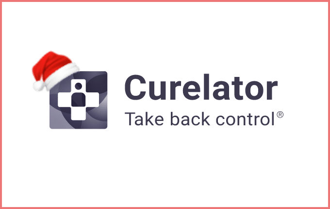
The symbol
The symbol is a representation of the globally recognized icon used for medical purposes.
Inside the cross, there is an icon of a person. It represents the “N of 1” concept (individual analysis) which is the main purpose behind all Curelator™ products.
The cross will always be shown inside the rounded square.
As a rule, the symbol shouldn’t be applied alone, but if there’s an exception it must be reviewed and approved by the Design team.
The logotype
The logotype is the name (as the word “logo type” indicates, it is an image created using typography).
The logotype is composed of the word “Curelator”.
The font chosen is Roboto Bold. All the letters are always applied in lower case: capitals letter should never be used.
The claim
The claim is the text containing our statement. The Curelator™ claim is “Take back control”.
The font used is Roboto Regular and all letters are always applied in lower case (small letters), never with Capital letters (upper case).
The ® symbol
The Curelator™ brand, like other corporate technologies, processes and materials, is subject to legal protection, therefore it must always be applied with the corresponding ® symbol.
Brand composition
The Curelator™ brand has a unique composition. All the elements should remain together and in the same position.
Clear space
In order to apply the brand correctly and give it the respect it deserves, always keep a clear space around it.
This distance is named “X” and is the equivalent of half of the total height of the symbol.
This “X” distance is the equivalent of a minimum amount of clear space that must always be kept around the branding.
Language
Although all corporate applications may be translated into other languages, the Curelator™ brand itself must always be in English and never translated.

Don’t play with it
The Curelator™ brand has been designed down to the last detail: don’t play with it.